categories

people
craft
music
art
food
film
oh comely
community

Oh Comely's Favourite Upcoming Exhibitions of 2016 (In Association with National Art Pass)

words Aimee-lee Abraham

15th December 2015

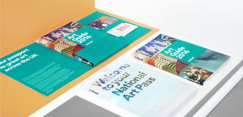
Oh Comely are thrilled to collaborate with Art Fund to offer readers the opportunity to feed their curiosity 365 days a year, with a generous discount on National Art Passes. 

Each card acts as a key, granting the user free or reduced entry into over 225 charged museums, galleries, castles and historic houses, as well as 50% reductions at major exhibitions including those at the British Museum, Tate, National Gallery and V&A

Beyond the nation's favourites, however, lies a wonderful selection of lesser-known exhibitions which offer a range of new and compelling perspectives.

Get three months access for just £10 here, or read on to hear more about our favourite off-beat exhibitions to look out for in 2016.

1. The Fallen Woman

The Foundling Museum, London

25 Sep 2015 – 3 Jan 2016, Free Entry with a National Art Pass

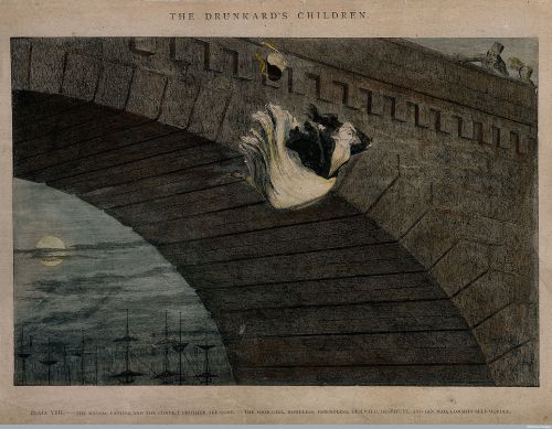
Often forced out of her home or workplace into destitution, prostitution or suicide, the 'fallen woman' was a popular theme in 19th century art and literature as Victorian moralists warned against the consequences of losing one’s virtue. The heartbreaking stories of these women’s lives, told through original testimonies and small tokens left behind by desolate mothers, are presented alongside mythologised images found in prints and illustrations of the time. An important exhibition. 

2. Pierdom: Photographs of Britain's Piers by Simon Roberts

Brighton Museum and Art Gallery

3 Oct 2015 - 21 Feb 2016, Free Entry with a National Art Pass


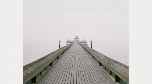
For Brighton local Simon Roberts, piers are an evocative symbol of our national identity. A century ago over 100 were dotted around the British coastline, yet today less than half remain standing. His project celebrates 'the personality, architecture and history' of the remaining structures, as well as some of the spaces where piers used to be seen. Also displayed are items from the museum’s local history archive focused around seaside memories, while visitors are encouraged to contribute their own anecdotes.

3. Death: The Human Experience 

Bristol Museum and Art Gallery

24 October - 13 March 2016, Free entry with a National Art Pass

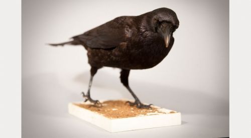
In an attempt to de-mystify the ultimate mystery, Bristol museum presents hundreds of ecletic objects – from a Ghanaian fantasy coffin to a Victorian mourning dress – all of which examine approaches to mortality from the earliest human societies to the modern day. The exhibition is accompanied by a series of compelling talks, discussing topics such as euthanasia and the commodification of the end. 

4. The Crime Museum: Uncovered

The Museum of London

9 October - 10 April 2016, 50% off Entry with a National Art Pass

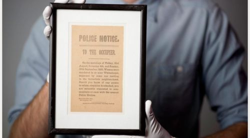
Take an uneasy journey through some of the UK’s most notorious crimes, from Dr Crippen to the Krays, the Great Train Robbery to the Millennium Dome diamond heist. Since its establishment by serving officers in the mid-1870s, the Crime Museum has previously only been open to police professionals and invited guests. Now, using original evidence from this extraordinary collection, real-life case files are unlocked for public viewing, personalising what is so often depersonalised.

5. Works to Know by Heart: An Imagined Museum

Tate Liverpool

20 Nov – 14 Feb 2016, 50% off entry with a National Art Pass

 This exhibition draws from Ray Bradbury's 1953  sci-fi novel, Farenheit 451. Tate Liverpool has created the fictional scenario in which the works of art on display are about to vanish and visitors are asked to commit them to memory. After this they are invited to a performance space where they can represent the works they believe should be remembered forever. Includes works by Duchamp, Sigmar Polke, Bridget Riley, Andy Warhol and Rachel Whiteread.

Oh Comely readers can enjoy an incredible three month National Art Pass for just £10. Visit artfund.org/discoverart today until 31st January 2016 to quench your creative thirst, and for full terms and conditions on the offer. 

This post is sponsored by Art Fund.

Images (Top-Bottom): Wellcome Library, Simon Roberts, Bristol Museums, Galleries and Archives, Museum of London, Pompidou/MNAM-CCI, Art Fund.

art

Salve Your Fine Fingers: Win a Crabtree & Evelyn Hand Cream for Every Month of the Year

words Sarah McCoy

3rd November 2015

All month we’ve been celebrating our bodies and marvelling at all the things it can do. Our hands for instance: ink stained, paint splattered, wind chapped, dough covered, muddy, soapy, going around opening doors, picking things up, clapping. Our hands do a lot.

So we thought we’d give them a treat. We’ve teamed up with Crabtree & Evelyn to give one lucky person a year's worth of hand pampering.

That’s right, a year's supply of Hand Therapy creams. Each 100g tube costs £15 and one lucky person will win twelve of them in different fragrances, one for each month of the year!

For the chance to win, get yourself on Facebook, Twitter or Instagram. 

On Twitter, follow Crabtree and retweet. On Facebook and Instagram, follow Crabtree and leave us a lovely comment here or here letting us know your favourite Autumnal smell.

Hurry, we're picking the winner on Monday!

art

The Body: a Celebration and a Party

words Sarah McCoy, illustration Marie Gardeski

7th October 2015

Issue 27 landed on doormats this week: The Body Issue. Except it isn’t an issue, it’s a celebration! And all celebrations require parties. Join us on Friday 16th October at 7pm as we take over the newest location of Tina We Salute You on the Olympic Park to rejoice in all the bizarre and wonderful things our bodies can do.

We’ll be joined by Sophie Scott, knitwear designer, who will be teaching us how to knit our very own muff-warmers--sorry, merkins--just in time for winter.

Meet some of the readers who featured in the magazine and see Varosha Lamb’s painted portraits of the women from the shoot.

Discover the white shirts that are made for every woman by London based in-grid who will be offering a 15% discount on their classic creations.

And above all just come and have a jolly good time.

Tickets include entry, a drink and goodie bag including materials to make your merkin. We will also be selling the magazine for anyone who hasn’t got their hands on it just yet.

Tina We Salute You, 2 Olympic Park Avenue, E20 1FT. Get your tickets here.


art

Brighton Art Fair: Ceramic Artist Elaine Bolt is Oh Comely's Best In Show

words Rosanna Durham

25th September 2015

With its elegant pier and excellent south-coast light, Brighton is renowned for artists. In its twelfth year, Brighton Art Fair has become a firm date in the calendar: an excellent opportunity to browse or buy contemporary work nurtured by the region. 

The Fair is well underway, so make sure you pass by this weekend: you're in for a creative treat. While you're there, keep an eye out for ceramic artist Elaine Bolt. Her beautiful work is Oh Comely's Best In Show this year: comprising hand-built objects and thrown vessels in porcelain, terracotta and mixed-media it's sure to take your breath away. Look out for a full interview with Elaine in our Christmas issue.

Brighton Art Fair, 24-27 September 2015, at the Corn Exchange / Elaine Bolt 

art

Where Boobs Grow On Trees: An Afternoon With Kaye Blegvad

words Maggie Crow, photos Stephanie Noritz

17th August 2015

From red body-suited rings of women on page 1, to a sinister wheel of fortune on page 128, Kaye Blegvad's illustration took over the Wheels Issue, and what a takeover it was. Her sweet-yet-sinister work also whirled our Cartwheels In a Box subscription parcel to life.

She spent an afternoon talking boobs and medieval art with Maggie Crow.

“I do seem to be having a naked lady phase.” Illustrator Kaye Blegvad is showing me around her Greenpoint studio. Formerly the boxing and labelling department of a pencil factory, the warehouse building has been turned into a workspace for Brooklyn creatives. Pens and ink litter the neatly-arranged desks and summer light floods through the windows.

Looking around I see evidence of Kaye’s myriad creative ventures: little plastic bags hold jewellery awaiting shipment, ceramic pots line the shelves, some filled with bright green succulents. Notably, boobs abound.

“I’ve always drawn tonnes of women but in the last couple years I’ve realised a weird power in the female body,” Kaye explains as she flicks the switch on a prototype for a sculpture, and two pairs of nipples light up. “There’s a lot of potential humour in it, too. A naked lady can be a serious political statement or it can be, ‘Yeah, I’m fun and naked. So what?’ There are options there that I like to play with.” With a tendency toward depictions of stoic women, the confrontation makes for a fantastic re-imagining of the naked lady trope. “A sexily reclining, angry-looking woman is something I enjoy a lot.”

Since graduating with a degree in illustration from the University of Brighton in 2010, Kaye has been remarkably busy for a young artist: not only taking commissions from the New York Times and Rookie magazine among others, but also turning her jewellery-making hobby into a successful small business, Datter, starting her own publishing house, Horizontal Press, and making highly covetable ceramics on the side.

You grew up in a house of artists, and your grandparents were artists as well. Is drawing something that you’ve been doing your whole life? Yes, it is. I’m a third-generation illustrator in my family. My grandfather was an illustrator, and his wife was a painter and a writer, and my dad is an illustrator, among other things. My mum is a painter. It’s in the blood somehow. Do we have a natural ability for it? It’s a struggle for all of us. We all wrestle with our abilities and think, “I’m awful, why am I doing this?” But I think there’s a kind of need there. We just have to. We’re doomed from birth to draw!

Do you feel that your style was influenced by your parents and grandparents? It was when I was younger. Now it’s more sensibilities than actual visual likeness. A lot of my dad’s work is pretty dark and weird and he’s into alchemy and surrealism and that definitely has rubbed off on me. My mum’s work is joyful; she does beautiful paintings, often quite abstract, and she has an incredible sense of pattern and colour. I don’t think it’s obvious in my work, but sometimes I’ll be doing things and think, “I totally stole this from mum.” She has a way of noticing beautiful little things, which is something that I try to do and has influenced how I make images.

What kind of little things does she notice? Nature is her religion. I’ll be walking down a gross street in Bushwick and find myself noticing a beautiful little weed, and I’ll think: that’s totally my mum noticing that for me. She would be able to take a photo of that, crop it in such a way to make it a gorgeous abstract image that suggested flowers. That’s not my process, but I really like noticing those little things from her.

Mixing that with my dad’s darkness and alchemy means that my work is somewhere in the middle. I don’t do body-horror, nightmare drawings—well, sometimes!—but my images aren’t pure joy and celebration. I like to think there’s a little bit of both of them.

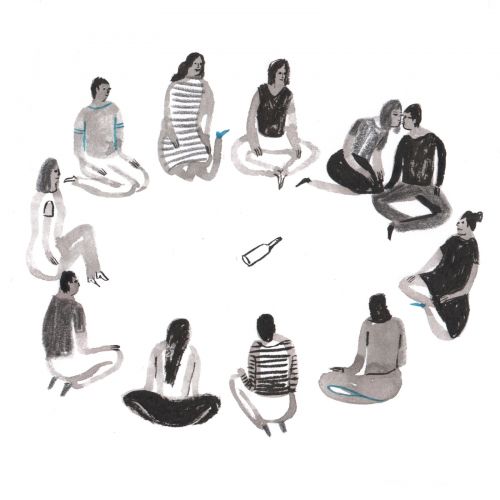
Kaye's illustration of Spin the Bottle, published in Issue 26.

Could you tell me about the wheel of fortune illustration you made for the inside back cover? It’s based on an archetypal medieval image. I love medieval artwork, how the drawings are so simple but somehow they just nail it every time. This is the Goddess of Fortune, a big sinister woman turning a wheel that has people on it—mankind at the whim of this goddess. There’s something really satisfying about that image. It’s a nice idea to be—well, is it a nice idea or a terrifying idea, to be at the whims of fortune?—but I felt like it was an interesting concept. I based it on a medieval illumination, but I wanted the figures to be more ambiguous. Maybe they’re just going round and round. The goddess isn’t evil, she’s not malicious. She might just want to give you a spin.

The way I understand it, your work is broken down into ceramics, jewellery and print work. Is that right? I work in a lot of different mediums and I like that a lot. I like being able to bounce between things. All of the work is drawing-based and my process is pretty analogue—inks and watercolours and straight onto paper where possible—but often there will be little things that I’ll add digitally. I’ll draw things in two or three pieces and then collage them together. It means that I have a lot of pieces of drawings, which is hard if you have to exhibit something because the images don’t really exist!

I have a lot of zine or small artist book projects on the go, but I often struggle with self-initiated things when there’s no deadline and it’s just my say-so. It’s nice to make things into a business or something more real than just ‘the personal work of Kaye Blegvad’. I like having reasons to make stuff beyond just self-amusement, sometimes.

Is self-amusement a big part of what drives you? A lot of my drawings are self-amusement, definitely. And things that I think are funny. Then I’ll show them to other people and they’ll be like, “This is sad and terrible!” and I’ll be like, “No, it’s hilarious, it’s clearly a joke!” My stuff goes dark faster than I expect it to. I was in a group exhibition a few weeks ago and the theme was Girls of Summer, but basically the theme was boobs (girls being a play on ‘the girls’). I’m never one to turn down drawing boobs, so I drew some girls and a big fruit tree, but instead of fruit there were boobs and the girls were picking boobs from the tree. I thought it was funny, so I showed it to some friends and some of them were absolutely horrified! Depending on your perception when looking at it, you could think, “Eugh! This is a nightmare world where women have to pick their own boobs!” But no, it’s supposed to be funny. Pick a huge, juicy boob off a tree and laugh about it.


Kaye Blegvad  / www.kayeblegvad.com

art

Sponsored Post: Shillington College

words Laura Maw

28th July 2015

Are you interested in graphic design, always doodling lettering in your notebook or dreaming up new dust jacket designs for your favourite novel?

Shillington College offers a Graphic Design Course, either 3 months full time or 9 months part time, learning skills from Adobe InDesign to typography, colour and taking on advertising briefs. With campuses in London and Manchester, you can learn to code, work to briefs and learn digital graphics all while studying in an amazing city. They also offer a short Web Development and Design Course, which is 1 week full time, or 5 weeks part time, covering styling content, designing web layouts, coding and building your own website, allowing you to work confidently as a graphic designer in both print and digital.


There are no lecture halls at Shillington: they teach graphic design through demonstrations, presentations and group workshops, with two full time teachers per class. No experience is necessary – whether you’re changing career completely or have just finished sixth form, the only thing they request is creativity and a love of design. You can learn more about studying at Shillington by attending their Information Sessions, at 11am on Saturday 29th August on both the London and Manchester campuses – more information is available here.

Find out more about Shillington’s courses at http://www.shillingtoncollege.co.uk.

art

Ledbury Poetry Festival: An Interview with Imtiaz Dharker

words Laura Maw

7th July 2015

Imtiaz Dharker is a Pakistan-born British poet, documentary filmmaker and artist. She won the Queen’s gold medal for her poetry last year and performed at Ledbury Poetry Festival this summer. The festival celebrates poetry in all its forms, and continues through to 12th July.

We spoke to Dharker about the festival and the themes of geography and home in her work. Our interview is illustrated with her drawings, more of which you can see on her website.

Do you prefer to perform your poetry aloud, or to see it written down? 

When I write a poem I have to read it aloud to know if it works. That is the only way to check if the music is there, and if it sounds like a true voice. Reading the poem aloud makes it possible to detect the wrong note and find the rhythm. That’s just during the process of writing, but then there is the later stage of reading aloud to an audience and I enjoy that too. For me, one of the greatest pleasures is hearing a poet, perhaps half-understanding, then finding the book, reading, rereading and taking time to delve into the poetry.

At Ledbury, your work was included as part of an evening of poetry called 'Dangerous Women'. Would you say female voices in poetry are becoming more prevalent and valued? 

I like the idea of being a dangerous woman. I think there are more spaces for all kinds of voices to be heard - voices that would have been suppressed or ignored earlier. Women are less inclined to censor themselves, less inhibited by who is listening and what they are thinking.

I love writing that explores the idea of the self and our relation to the spaces we inhabit. Your poetry is full of references to geography: India, Pakistan and Britain. One of my favourite lines in Purdah is, 'In the tin box of your memory, a coin of comfort rattles, against the strangeness of a foreign land.' What is the relation between identity, memory and space for you? 

I love poems that have a location and a precise geography where places are named, even if the names sound mundane. I grew up reading literature and watching films that made the Underground stations of London or the streets of San Francisco as familiar as my own neighbourhood.

It feels good now to let the myths to flow the other way, to make readers walk the streets of Bombay or Lahore. In The Terrorist At My Table, the poems go in search of lost histories, the magic words and places, the idea of paradise, the dreams of people who have been reduced to one dimension and the mythology of cities that are remembered only as war zones.

You also explore the idea of home and what it means in your poetry, often alternating between spaces and countries, as in They’ll Say: She Must Be From A Different Country. Why does the idea of home fascinate you? 

Wherever we are born, wherever we live, our identity is always travelling, always fluid. I am changed every day by the things I see and the people I come across, or what I read or hear. So in Bombay (to me it will always be Bombay not Mumbai) the voices come straight off the street into my poems, and the soundtrack is rickshaw horns, rattling trains and lines from Arun Kolatkar.

In London, my background music is opera and my own footsteps on quiet streets and canals, because I am a walker and London is a great city to walk in. In Glasgow, my accent turns a little more Scottish and in the Vale of Clwyd in Wales, I feel related to Gerard Manley Hopkins. In the end, I feel most at home in the company of poets, alive or dead.

Ledbury Poetry Festival, 3rd - 12th July

art

Agnes Martin: The Quiet Painter

words Laura Maw

14th June 2015

Painter Agnes Martin was an American artist whose work is known for its elegant colour washes and precise pencil grids. A rigorous editor of her own work, she destroyed many of the paintings she was not satisfied with. This summer, Tate Modern holds the first retrospective exhibition of Martin’s work since her death in 2004.

To the unfamiliar eye, the paintings can at first appear very similar. But each is a world of its own and, after visiting the show, I was keen to learn more about Martin's work. I spoke to Dr Lena Fritsch, Assistant Curator at Tate Modern, for her own perspective on the show. 

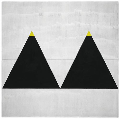
 Agnes Martin, Untitled #1, 2003

Tell us about your experience of curating the exhibition. I did my PhD in art history with a focus on Japanese photography so my expertise isn't Agnes Martin, but I think the way that I look at her work has changed a lot. At first sight and when working with reproductions, they all look the same. Martin said that too, actually. There’s a famous quotation from when she went to one of her own exhibitions and remarked that they all looked the same. But when you work on her paintings for such a long time, you notice all the variation and small details.

Agnes Martin, Gratitude, 2001

I saw a lot of the paintings online and I felt that they were all quite similar too, but seeing them in person is really quite different. Which part of curating the exhibition was the most interesting for you? What I’m really happy about is the work we received from private lenders, especially in room three, where we have the small, experimental works. People who know Martin’s work associate her either with the grid or her later striped paintings, but usually don’t think of an earlier sculpture like the Burning Tree (1961). Almost all the works in this third room are from nineteen different lenders!

There’s also a small painting, kept in a private collection, which was a wedding gift from Martin to the owners, and it has never been shown in a public exhibition before. It’s exciting to have such a personal work on show.

It’s only in the fifth room of the exhibition that we learn about Martin’s schizophrenia. Was that a conscious decision not to portray her as an artist with a mental illness from the start? Yes, in the fifth room it’s the first time that we mention it. We didn’t want to emphasise the connection too much, but at the same time we didn’t want it leave it out.

Agnes Martin, Untitled, Fondation Hubert Looser, 1977

You mention the way Martin sought solitude, most notably in 1967, when she took a five year break from painting and left New York for New Mexico. Do you think there’s a marked difference in her work afterwards in 1973? It’s interesting to see how the way she lived and the landscape in New Mexico influenced her work after the five year break. I’ve never been to New Mexico, but my colleagues went and said that if you look at the paintings, the light and landscape there makes you see them in a new way – the colours appear differently. In the grid structure, there are definitely references to her earlier work, yet in the colour there’s a strong influence from New Mexico.

Agnes Martin exhibition runs from 3 June to 11 October 2015 at Tate Modern. Admission £10.90 (£9.50 concession).

Agnes Martin, Untitled #10, 1990

art